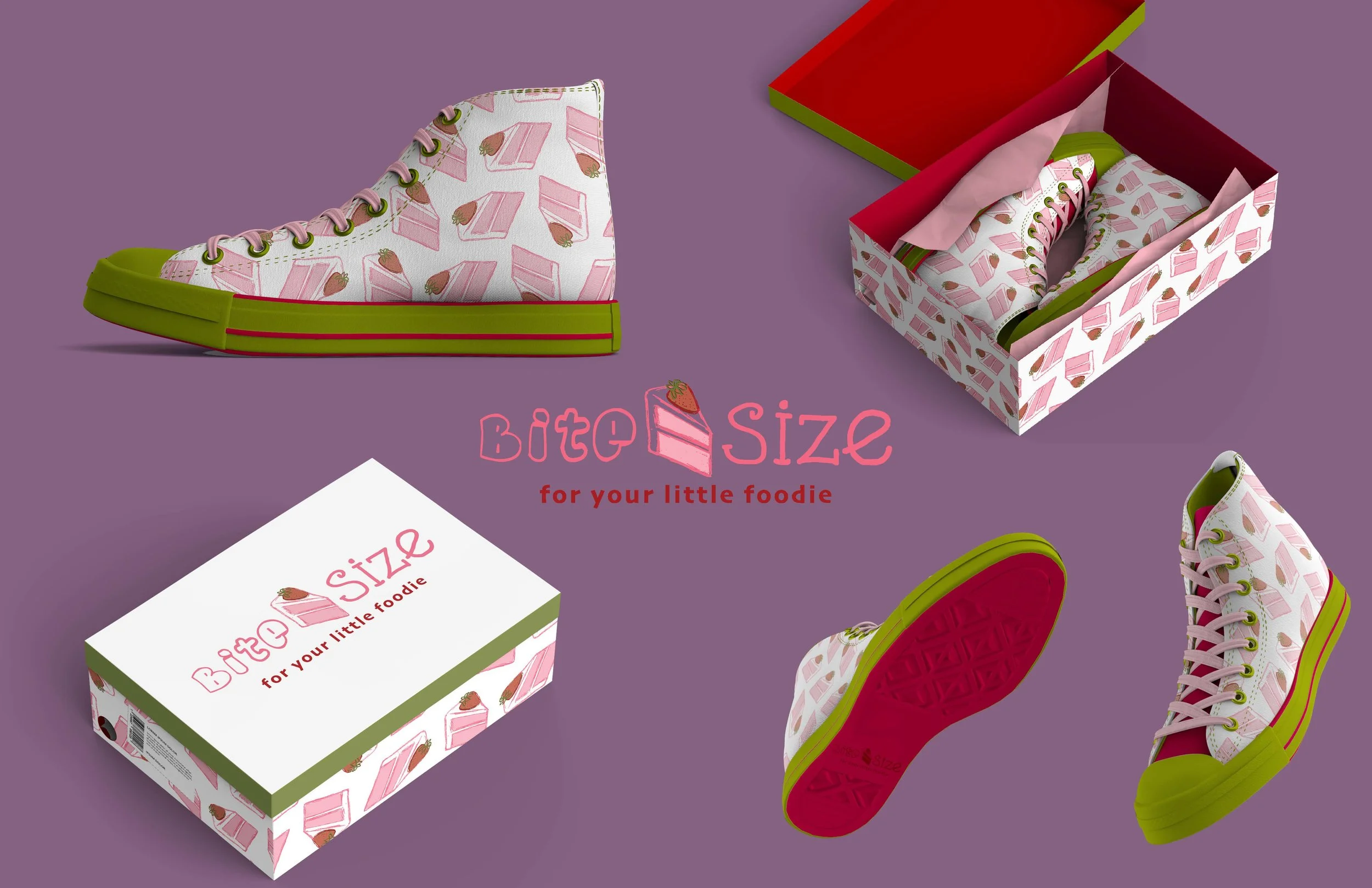
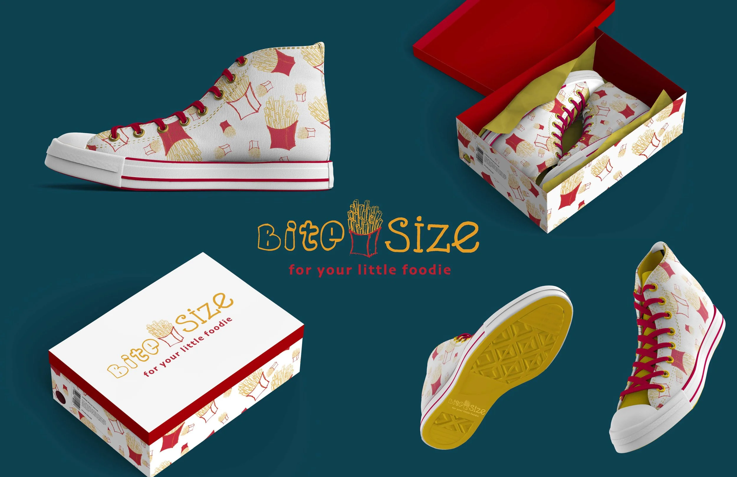
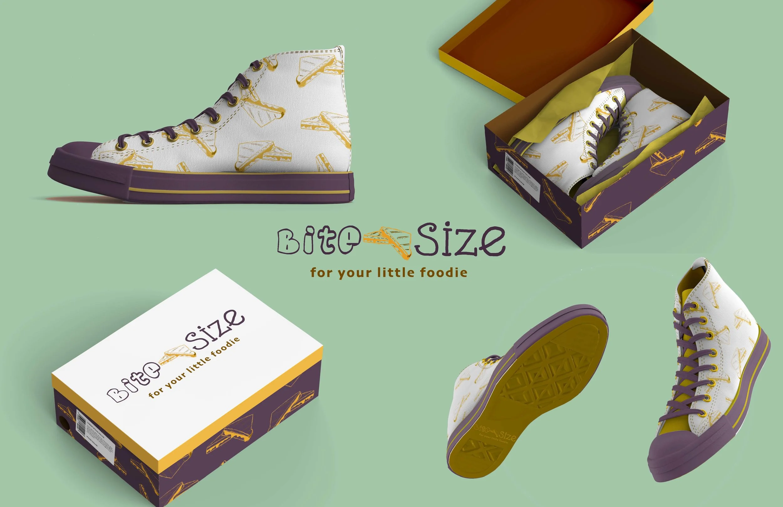
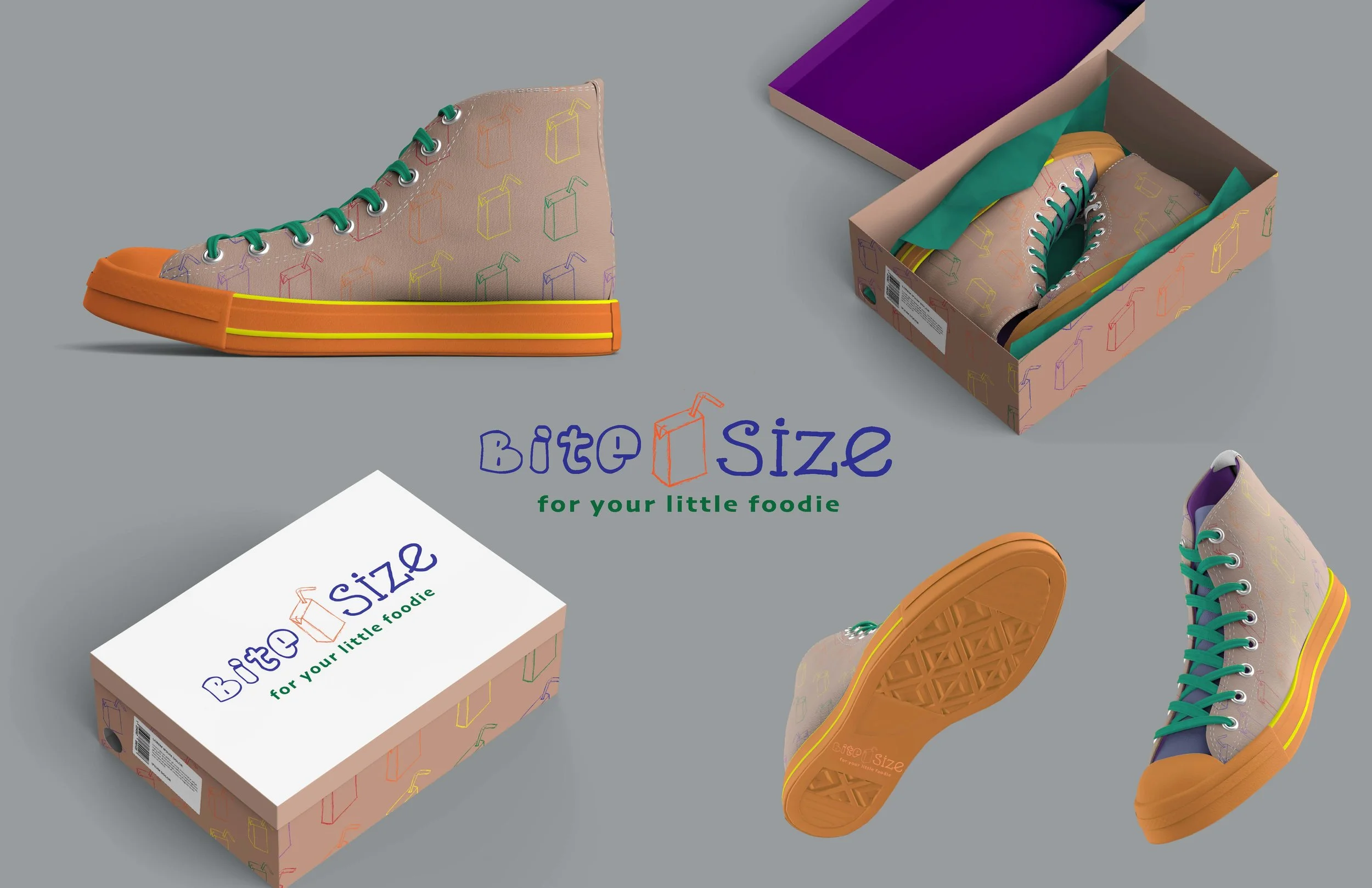
Each shoe represents a different food item. The logo changes depending on which shoe is being shown. The boxes are even customized with the shoe pattern inside. The food icons are hand drawn and then vectorized to create patterns. The idea was to keep the colors very whimsical but still realistic enough that food is recognizable. Also, I feel that food is very gender neutral and children buying these will not feel like they have to choose the one that is for their gender.